Attack of the highwaymen – how I lost $150 on poorly designed UX
- poor ux design
- customer issues
- costly mistakes

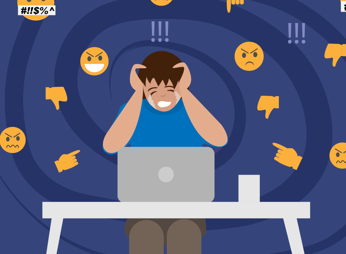
This morning, I set out to buy a single motorway vignette (toll sticker) for my car using the PARKL app—a platform I regularly use for parking. A new feature allowed users to purchase vignettes directly, making it an attractive and convenient option. However, within seconds, I found myself accidentally purchasing two—one for a car I no longer use, wasting nearly $150. All because of poorly designed UX. This blog post isn’t just a rant about my experience—it’s a case study in how to avoid costly UX mistakes that lead to user frustration, financial loss, and ultimately, brand damage.
What Went Wrong?
I selected an annual nationwide vignette and tapped the Buy button. The transaction went through instantly, without an “Are you sure?” screen. There was no warning about the transaction being irreversible or that vignette purchases are non-refundable by law. The app automatically selected a license plate—the most recently added one—without prompting me to confirm. Only after payment did I realize that the vignette was assigned to a rented car I no longer use.
While I appreciate one-click payments and frictionless UX, transactions that involve high-value, non-reversible purchases should include a clear warning. The app did not indicate that pressing the button would immediately charge my account. When I reached out to customer support, I was met with a generic response citing the terms and conditions, essentially blaming me for not double-checking the details. This was not just frustrating but humiliating, as it dismissed any responsibility on the platform’s part to ensure a better user experience.
The Fix: How to Avoid This UX Pitfall
Great UX is a delicate balance between frictionlessness and error prevention. Remove too many steps, and users make costly mistakes. Add too many, and you create frustration. The key is designing interactions that feel effortless while ensuring critical decisions are deliberate and reversible when necessary.
A more thoughtful design could have easily prevented this mistake. If multiple license plates are stored, the app should not pre-select one by default. Instead, users should be required to actively choose from their stored plates. This small but crucial step would force conscious decision-making and minimize errors.
A transaction summary screen should always appear before finalizing the purchase, displaying key details such as license plate, vignette type, amount, and a bolded warning that the transaction is final and non-refundable. This ensures that users have a last chance to review their information.
For non-reversible transactions, a confirmation checkbox could be required before proceeding, explicitly stating, “I confirm that I have reviewed my details and understand this purchase is non-refundable.” This extra step makes users consciously acknowledge the importance of their decision.
Accessibility should also be a key consideration. Many people, including myself, are neurodivergent, with ADHD or similar cognitive traits. The concept of the “ADHD tax” refers to the financial penalties neurodivergent individuals face due to impulsivity, distractibility, or poorly designed interfaces. A larger font summary screen, a more explicit confirmation step, and clearer warnings would significantly reduce accidental purchases, benefiting all users, not just those with ADHD.
Beyond the UX design itself, companies must rethink how they handle customer issues. Instead of shifting blame, they should acknowledge flaws and offer goodwill resolutions. If refunds are legally impossible, they could provide credit or alternative compensation to maintain trust and goodwill.
UX Matters: Design for the Real World
Buying a vignette at a gas station involves an attendant confirming the details, printing a receipt, and requiring a signature. This extra step prevents costly mistakes. The same principle should apply to digital experiences, especially for high-value, non-refundable transactions. UX should be seamless but never reckless. Automation should simplify the process but never remove critical user decisions. One-click payments should always come with an explicit warning.
A well-designed UX doesn’t just optimize convenience—it protects users from making costly mistakes. It’s time to design better.
Thomas Biro
co-founder & chairmainagile business architect,
agile coach
Sense/Net

Co-founder of Sense/Net & Barion, author of Digital Readiness Framework. Tom graduated in engineering from Nottingham Trent University. Since the advent of the Internet, he has been involved in digitalization, initially focusing on the technical, and later on the human aspects. Tom is an M-shaped talent, with extensive knowledge in IT, entrepreneurship, and agile. He likes to promote provocative ideas. In his view, only free, critical, and scientific thinking will move humanity forward. He believes that the essence of agility is the agile mindset, which he puts great emphasis on teaching.


 The website includes cookies